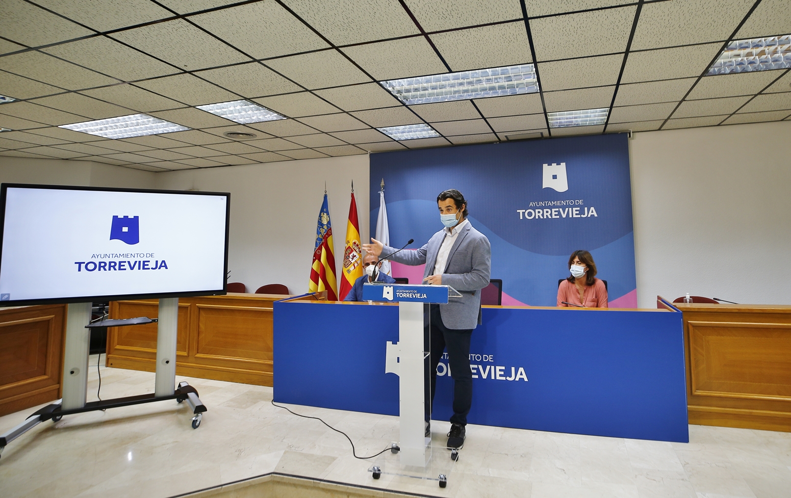
TORREVIEJA mayor, Eduardo Dolon, has unveiled a new corporate logo for the Costa Blanca city.
€33.000 of public money has been spent on producing the new symbol.
Eduardo Dolon said: “This logo represents the heart of Torrevieja city with a modern contemporary feel coupled with its entrepreneurial spirit.”
The symbol depicts a watch tower(Torre-Vieja) with a wave at the bottom representing the Mediterranean Sea.
Head of PR firm, Grupo Anton Communicacion, Susana Anton said: “The tower reflects the historic origin of the municipality with the wave splashing up against the area’s iconic salt mountains.”
“There are three turrets on the tower plus an open window to the world which symbolises Torrevieja’s multiculturalism and the welcoming nature of the city,” added Anton.
Her extensive explanation of the logo took in the colours, with blue unsurprisingly representing the sea, and white to cover the area’s salt industry.
The colours are interchangeable on the logo.
A pink variant will also pop up on some of the council’s corporate communications to reference the colour of Torrevieja’s salt lakes.
Dolon said that the company had been working for ‘several months’ on the design.
READ MORE TORREVIEJA LANDMARK GETS A MAJOR MAKEOVER 46 YEARS AFTER ITS UNVEILING
TORREVIEJA AREA HEALTH SERVICES TO DEFINITELY RETURN TO PUBLIC MANAGEMENT


