THE Junta de Andalucia have released their new representational logo.
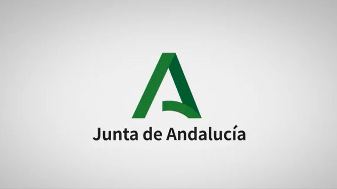
A green capital A is the new symbol to represent Spain’s most populous region.
It replaces the one that has been used for decades, an arch over two columns, on a green background.
The government claims the logo is respectful of the history of Andalucia, adapted to the times and friendly to the environment.

But some critics insist that the Junta’s new logo looks like a ‘back hander’, appropriate after decades of corruption saw billions stolen by greedy politicians in Sevilla.
The new design, which cost €14,500, was also criticised by unhappy taxpayers, who took to social media saying it could have been created far cheaper.
The logo was also compared to other brands such as Adobe and Aquarius.
Work on the logo was carried out by the Seville agency Happy Communication and is designed by Juan Carlos Patron.


